First of all, some people, in wrong regions of the world, trying to learn Japanese, will find Chinese variants. Apparently, this doesn't happen in Japan, or in Japanese non-digital media, anyway; so I think it is debatable whether you need to how these variants.
However, when you go outside Japan, even with a correct font, but the font also includes Chinese, you might see a wrong variant.
# Font differences that surprise you
First of all, some people, in wrong regions of the world, trying to learn Japanese, will [find Chinese variants.](https://community.wanikani.com/t/x/55303) Apparently, this doesn't happen in Japan, or in Japanese non-digital media, anyway; so I think it is debatable whether you need to how these variants.
However, when you go outside Japan, even with a correct font, but the font also includes Chinese, you might see a wrong variant.
In the character 角 in traditional Chinese, as well as in Japanese, Korean and Vietnamese, the central vertical stroke does not extend below the last horizontal line, the one formed by the seventh, last stroke. This creates an appearance roughly equivalent to 土 enclosed in the top part of 冂.
However, in simplified Chinese, the central vertical stroke in 角 extends to the bottom of the character (as in 用). This difference applies to all simplified Chinese characters containing this radical.
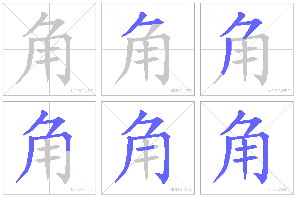
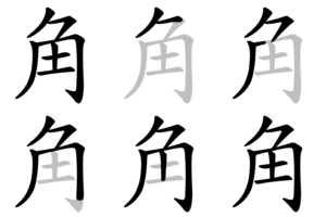
Note that the Chinese and Japanese stroke order is slightly different for the fifth and sixth strokes, as illustrated in the animations above.
冎 in 過ぎ, 骨
Simplified Chinese 過
Japanese 過
The top section of the character turns left (◱) in PRC and Singapore, while it turns right (◲) elsewhere.
直
Simplified Chinese 直
Japanese 直
Note the different forms, which differ in two respects: both Simplified and Traditional do not have a left vertical stroke, while the orthodox form has a left vertical stroke; and in simplified form, the top component is connected with the bottom, while in the orthodox they are separated – this last difference is shared with unrelated characters 真 and 具. The older form and stroke order are officially used in Japan but an alternative writing in other countries.
空
Simplified Chinese 空
Japanese 空
In Simplified Chinese, the 5th stroke is straightened, but in Japanese, it is curved.
器
Simplified Chinese 器
Japanese 器
In all regions except Japan, the middle component is written 犬, which is the orthodox form found in the Kangxi dictionary.
In Japanese shinjitai, the middle component is written 大 instead of 犬 (the upper right dot is missing). Due to Han unification, both forms are encoded using the same code point. This character may appear to be different depending on the font used.
A CJK compatibility ideograph exists at U+FA38 for the kyūjitai form of 器 which has 犬 as the middle component.
誤
Simplified? Chinese 誤
Traditional? Chinese 誤
Japanese 誤
This character, 吴, is the simplified and variant traditional form of 吳.
In some cases, the code points are indeed different, for example
內/内
兌/兑
氣/気
紅/红
語/语
# Chinese variants
<details>
<summary>角</summary>
- Simplified Chinese <span lang="zh-CN">角</span>

- Japanese <span lang="ja-JP">角</span>

- Others

In the character 角 in traditional Chinese, as well as in Japanese, Korean and Vietnamese, the central vertical stroke does not extend below the last horizontal line, the one formed by the seventh, last stroke. This creates an appearance roughly equivalent to 土 enclosed in the top part of 冂.
However, in simplified Chinese, the central vertical stroke in 角 extends to the bottom of the character (as in 用). This difference applies to all simplified Chinese characters containing this radical.
Note that the Chinese and Japanese stroke order is slightly different for the fifth and sixth strokes, as illustrated in the animations above.
</details>
<details>
<summary>冎 in 過ぎ, <ruby>骨<rt>ほね</rt></ruby></summary>
- Simplified Chinese <span lang="zh-CN">過</span>
- Japanese <span lang="ja-JP">過</span>
The top section of the character turns left (◱) in PRC and Singapore, while it turns right (◲) elsewhere.
</details>
<details>
<summary>直</summary>
- Simplified Chinese <span lang="zh-CN">直</span>
- Japanese <span lang="ja-JP">直</span>
Note the different forms, which differ in two respects: both Simplified and Traditional do not have a left vertical stroke, while the orthodox form has a left vertical stroke; and in simplified form, the top component is connected with the bottom, while in the orthodox they are separated – this last difference is shared with unrelated characters 真 and 具. The older form and stroke order are officially used in Japan but an alternative writing in other countries.
</details>
<details>
<summary>空</summary>
- Simplified Chinese <span lang="zh-CN">空</span>
- Japanese <span lang="ja-JP">空</span>
In Simplified Chinese, the 5th stroke is straightened, but in Japanese, it is curved.
</details>
<details>
<summary>器</summary>
- Simplified Chinese <span lang="zh-CN">器</span>
- Japanese <span lang="ja-JP">器</span>
In all regions except Japan, the middle component is written 犬, which is the orthodox form found in the Kangxi dictionary.
In Japanese shinjitai, the middle component is written 大 instead of 犬 (the upper right dot is missing). Due to Han unification, both forms are encoded using the same code point. This character may appear to be different depending on the font used.
A CJK compatibility ideograph exists at U+FA38 for the kyūjitai form of 器 which has 犬 as the middle component.
</details>
<details>
<summary>誤</summary>
- Simplified? Chinese <span lang="zh-CN">誤</span>
- Traditional? Chinese <span lang="zh-TW">誤</span>
- Japanese <span lang="ja-JP">誤</span>
This character, 吴, is the simplified and variant traditional form of 吳.
</details>
In some cases, the code points are indeed different, for example
- 內/内
- 兌/兑
- 氣/気
- 紅/红
- 語/语
Font differences that surprise you
First of all, some people, in wrong regions of the world, trying to learn Japanese, will find Chinese variants. Apparently, this doesn't happen in Japan, or in Japanese non-digital media, anyway; so I think it is debatable whether you need to how these variants.
However, when you go outside Japan, even with a correct font, but the font also includes Chinese, you might see a wrong variant.
Chinese variants
角
In the character 角 in traditional Chinese, as well as in Japanese, Korean and Vietnamese, the central vertical stroke does not extend below the last horizontal line, the one formed by the seventh, last stroke. This creates an appearance roughly equivalent to 土 enclosed in the top part of 冂.
However, in simplified Chinese, the central vertical stroke in 角 extends to the bottom of the character (as in 用). This difference applies to all simplified Chinese characters containing this radical.
Note that the Chinese and Japanese stroke order is slightly different for the fifth and sixth strokes, as illustrated in the animations above.
冎 in 過ぎ, 骨
The top section of the character turns left (◱) in PRC and Singapore, while it turns right (◲) elsewhere.
直
Note the different forms, which differ in two respects: both Simplified and Traditional do not have a left vertical stroke, while the orthodox form has a left vertical stroke; and in simplified form, the top component is connected with the bottom, while in the orthodox they are separated – this last difference is shared with unrelated characters 真 and 具. The older form and stroke order are officially used in Japan but an alternative writing in other countries.
空
In Simplified Chinese, the 5th stroke is straightened, but in Japanese, it is curved.
器
In all regions except Japan, the middle component is written 犬, which is the orthodox form found in the Kangxi dictionary.
In Japanese shinjitai, the middle component is written 大 instead of 犬 (the upper right dot is missing). Due to Han unification, both forms are encoded using the same code point. This character may appear to be different depending on the font used.
A CJK compatibility ideograph exists at U+FA38 for the kyūjitai form of 器 which has 犬 as the middle component.
誤
This character, 吴, is the simplified and variant traditional form of 吳.
In some cases, the code points are indeed different, for example
Font matters
There are also times that font matters. Including not Kanji.
そ
令
噌
祓